Coca Cola Online Product Imagery
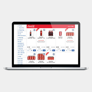
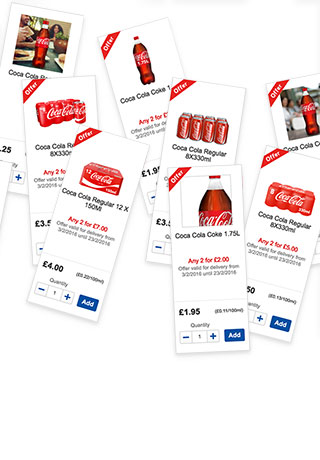
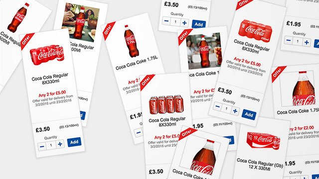
Coca-Cola products are sold in packaging that looks very similar across different sizes and variants. On online grocery websites users are presented with a grid of very similar looking thumbnail images. It can be very difficult to distinguish between sizes and variants in this context, and customers frequently select the wrong product.
I conducted a focussed UX project to explore ways to improve the way products are displayed.
I produced a number of visual concepts to use in customer research. Eye-tracking was used to determine precisely where customers look when making purchase decisions.


Small changes to the product images can lead to significant improvements in customers' understanding.


